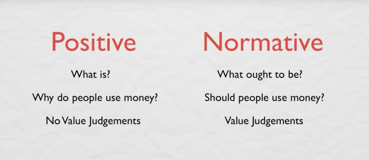
In the eighth installment of Before and After, I had the task to differentiate between elements so the message is clear to the learner. I selected the "Normative vs Positive" image because the information on this page did not stand out for the learner to understand the difference between these two elements. The text font is similar and besides the black and red colors in the font, there are no other elements that stand out for the learner to understand the material. The gray background in the before image does nothing to aid in comprehension for the learner.
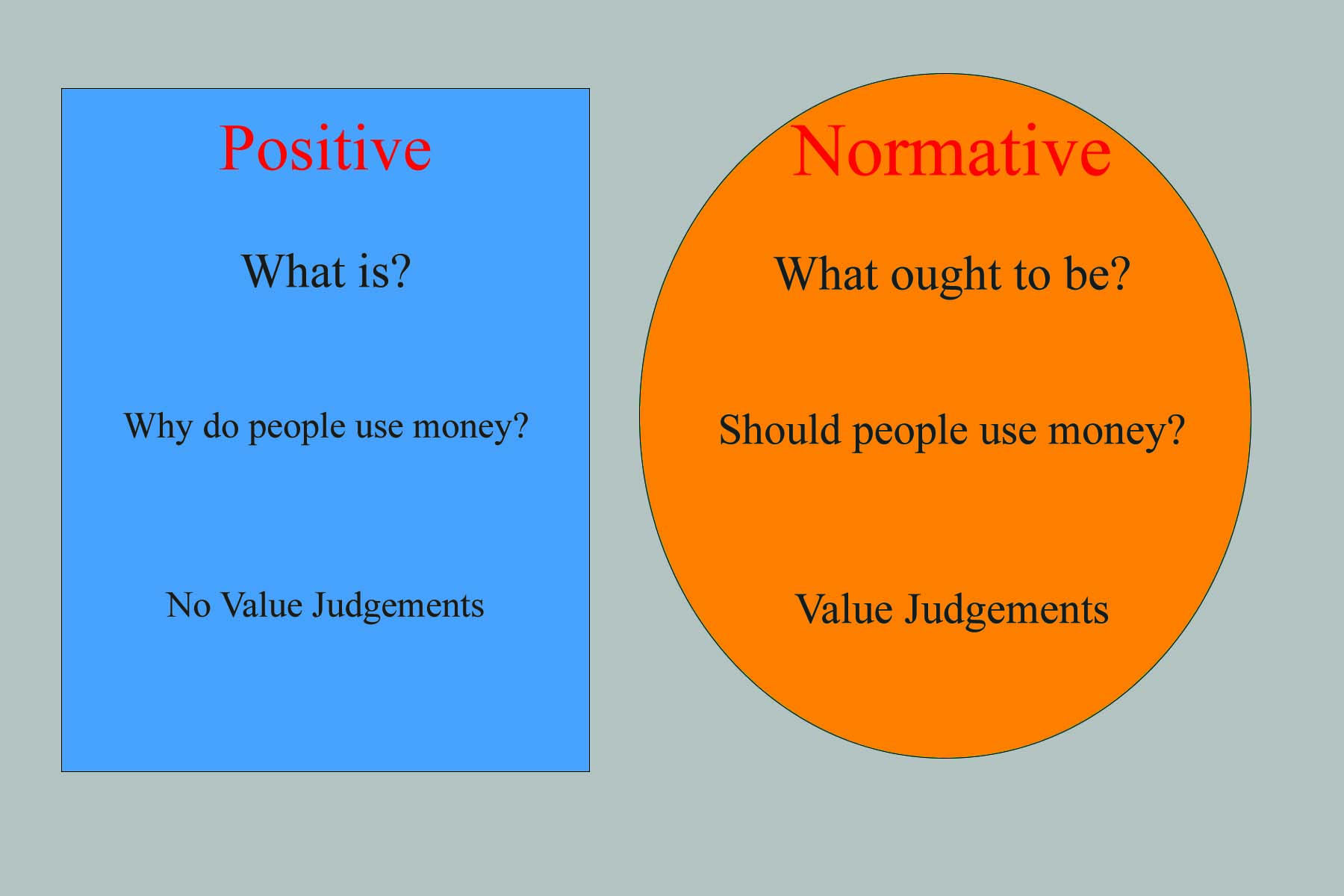
Therefore, in the after image, I first utilized different shapes in forms of a rectangle and circle to first differentiate the elements. Second, I utilized warm colors in "Normative" side in orange, while the "Positive" had cold colors in blue. These colors are found within the shape. I decided to keep the font the same in terms type and color in order for the colors and the shape to stand out for the learner. Also, I kept a grey background to keep the elements distinctive. Overall, the after image makes the elements of the slide unique for the learner to understand the difference between "Positive" and "Normative".
Therefore, in the after image, I first utilized different shapes in forms of a rectangle and circle to first differentiate the elements. Second, I utilized warm colors in "Normative" side in orange, while the "Positive" had cold colors in blue. These colors are found within the shape. I decided to keep the font the same in terms type and color in order for the colors and the shape to stand out for the learner. Also, I kept a grey background to keep the elements distinctive. Overall, the after image makes the elements of the slide unique for the learner to understand the difference between "Positive" and "Normative".
| beforecontrast.png |
| aftercontrast.jpg |
| aftercontrast.psd |
