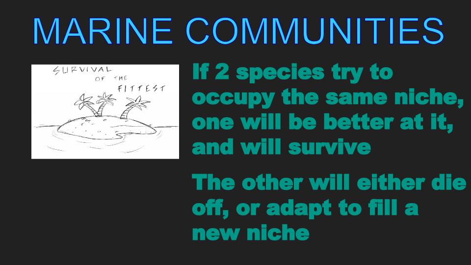
In the fourth installment of Before and After, I had the task to add better colors to an after image. I selected the "Marine Communities" image since I did not like black background and the colors used in the piece. I could imagine a learner trying to distinguish this information in a darken classroom- it would be hard to keep focus on this information. The colors in the background and the text utilized in the original image were uninspiring and dull for the learner. The original island picture was boring for the learner since it was in black and white, and this image does not sustain attention for the learner.
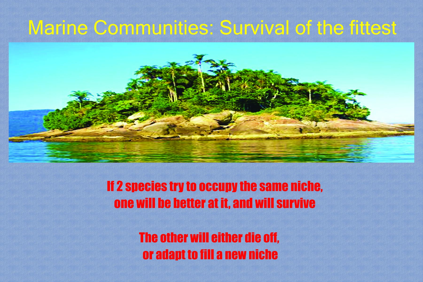
In the after image, I changed the background to have a light blue carpet overlay which to the learner looks like waves. I changed the title of the image text to yellow, which creates excitement for the learner, and I changed the two smaller pieces of text color into red, which makes that text stand out over the blue background. The smaller pieces of text were centered. The island image was selected from a google image search because the image was bright and visually appealing to the learner. The title, text, and picture was divided into thirds to gain learner attention.
In the after image, I changed the background to have a light blue carpet overlay which to the learner looks like waves. I changed the title of the image text to yellow, which creates excitement for the learner, and I changed the two smaller pieces of text color into red, which makes that text stand out over the blue background. The smaller pieces of text were centered. The island image was selected from a google image search because the image was bright and visually appealing to the learner. The title, text, and picture was divided into thirds to gain learner attention.
| beforecolor.jpg |
| aftercolor.jpg |
| aftercolor.psd |
