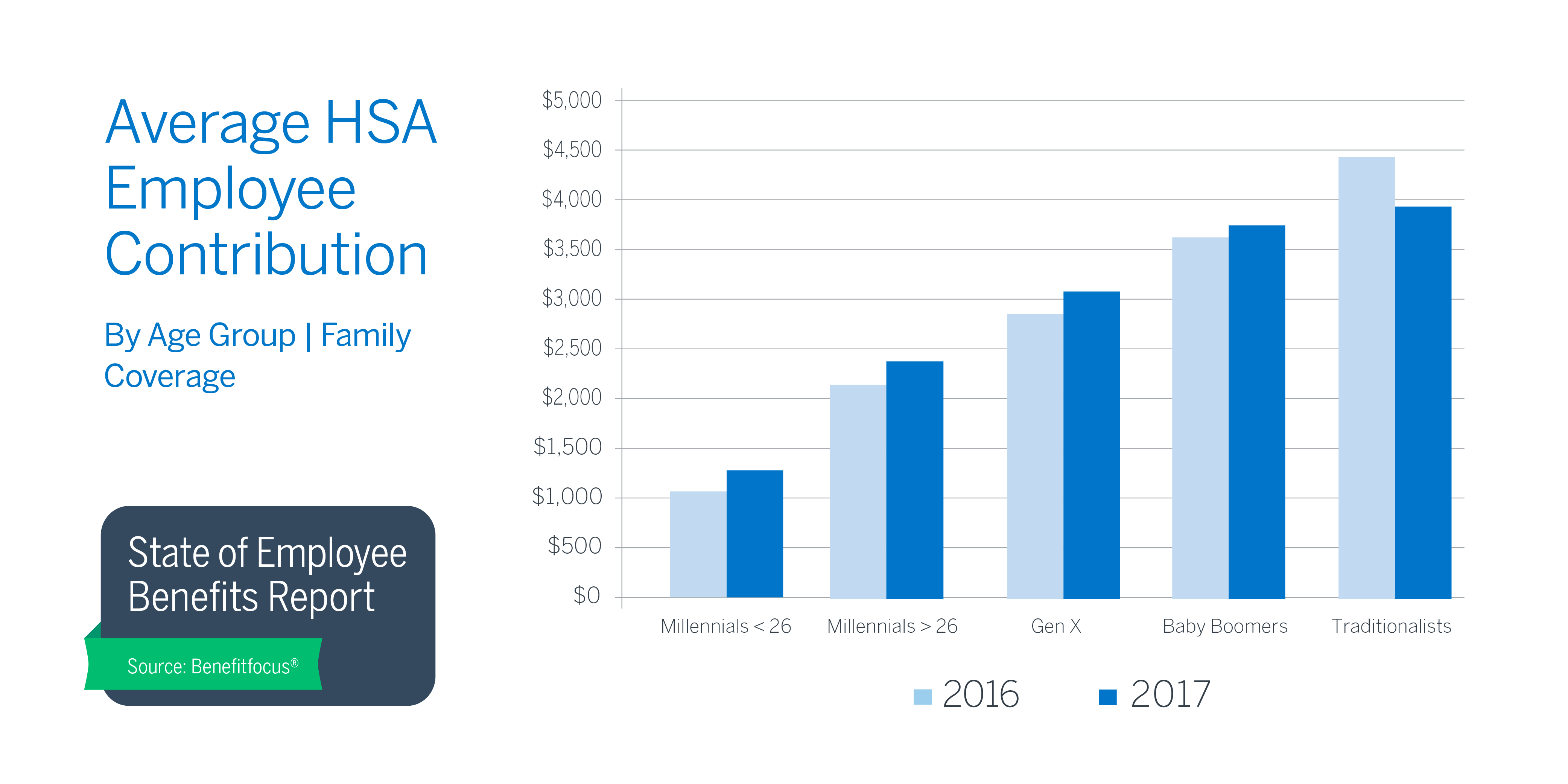
In the twelfth installment of Before and After, I had the task to make numbers clear to the learner. I selected the "Average HSA Employee Contribution" image because the difference between the two years are not easy to differentiate in the bar graph.
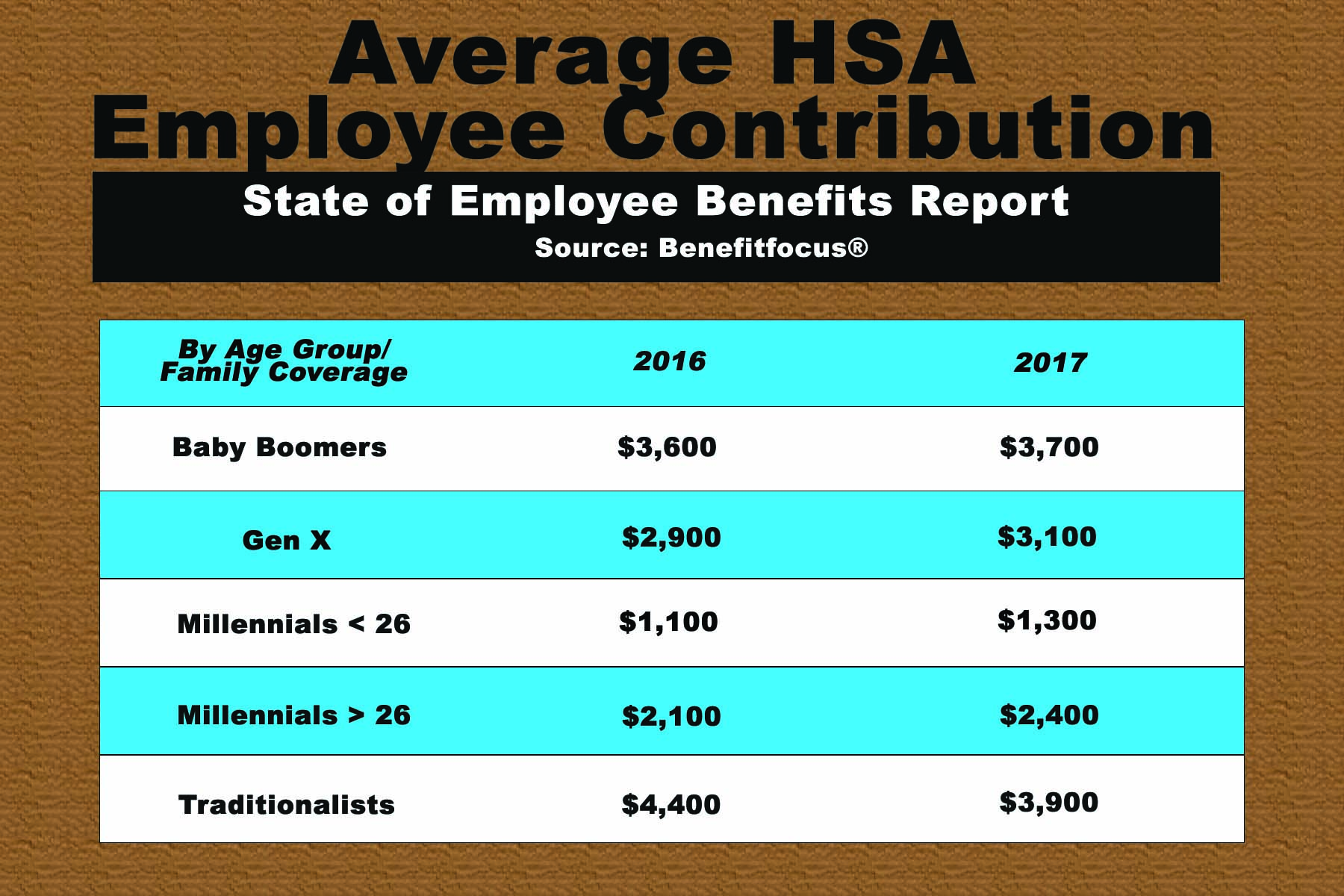
Therefore, in order to add visualization to the after image, I decided to utilize a data table because it is an easy way to compare and contrast the numbers. The numbers are clear to the learner because of the white space between the group and the two years. A blue and white color scheme for each row was added so the learner could easily follow the information with their eyes. Information was organized alphabetically to add order to the after image. Text was made consistent with font and color. The title and source of information was put on the top so the learner could understand what the image was about.
Therefore, in order to add visualization to the after image, I decided to utilize a data table because it is an easy way to compare and contrast the numbers. The numbers are clear to the learner because of the white space between the group and the two years. A blue and white color scheme for each row was added so the learner could easily follow the information with their eyes. Information was organized alphabetically to add order to the after image. Text was made consistent with font and color. The title and source of information was put on the top so the learner could understand what the image was about.
| beforevisualization.png |
| aftervisualization.jpg |
| aftervisualization.psd |
